Data Analytics • Healthcare
Healthcare HR Dashboard
Built with Tableau, Python, and Faker to explore healthcare workforce trends.
HR
Workforce analytics
3+
Key themes
1
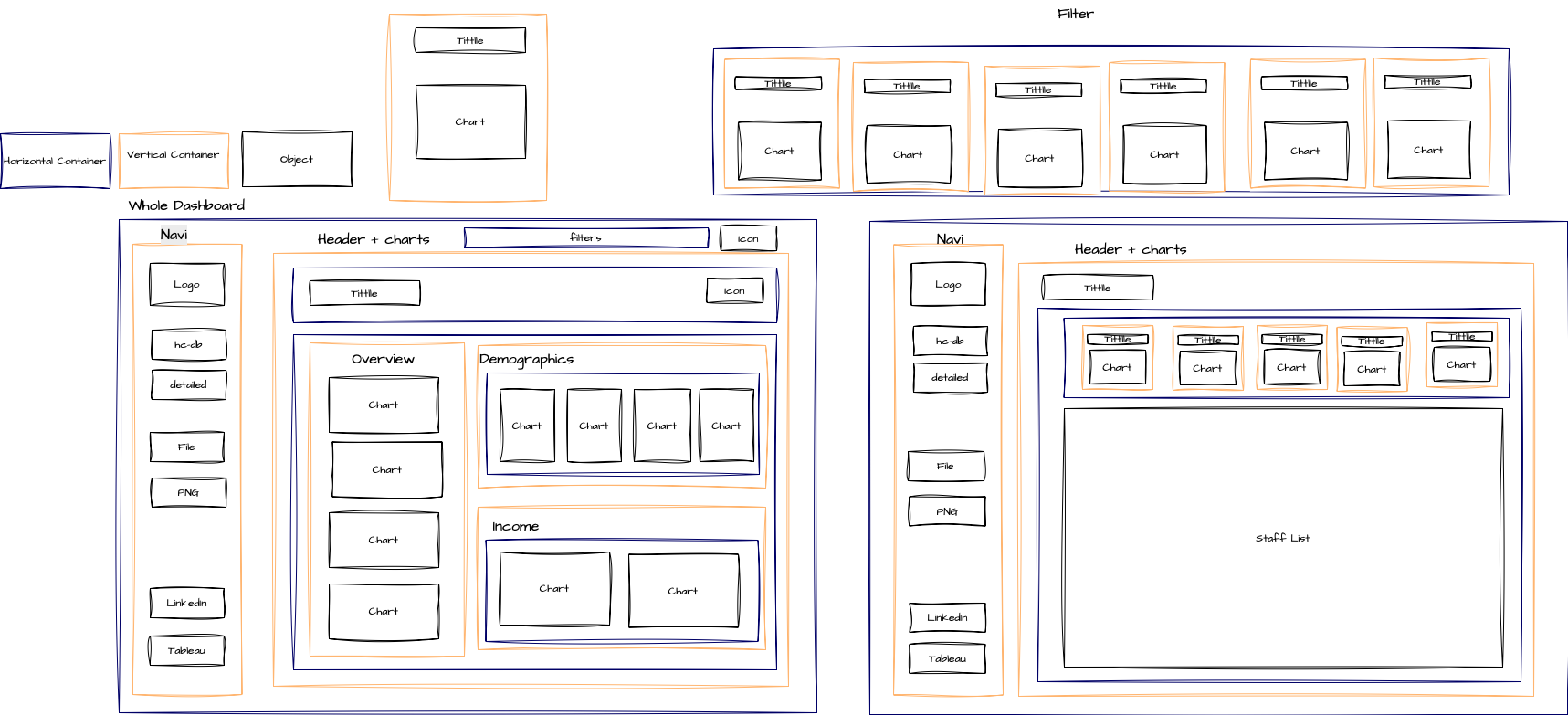
Dashboard experience
Dashboard Preview

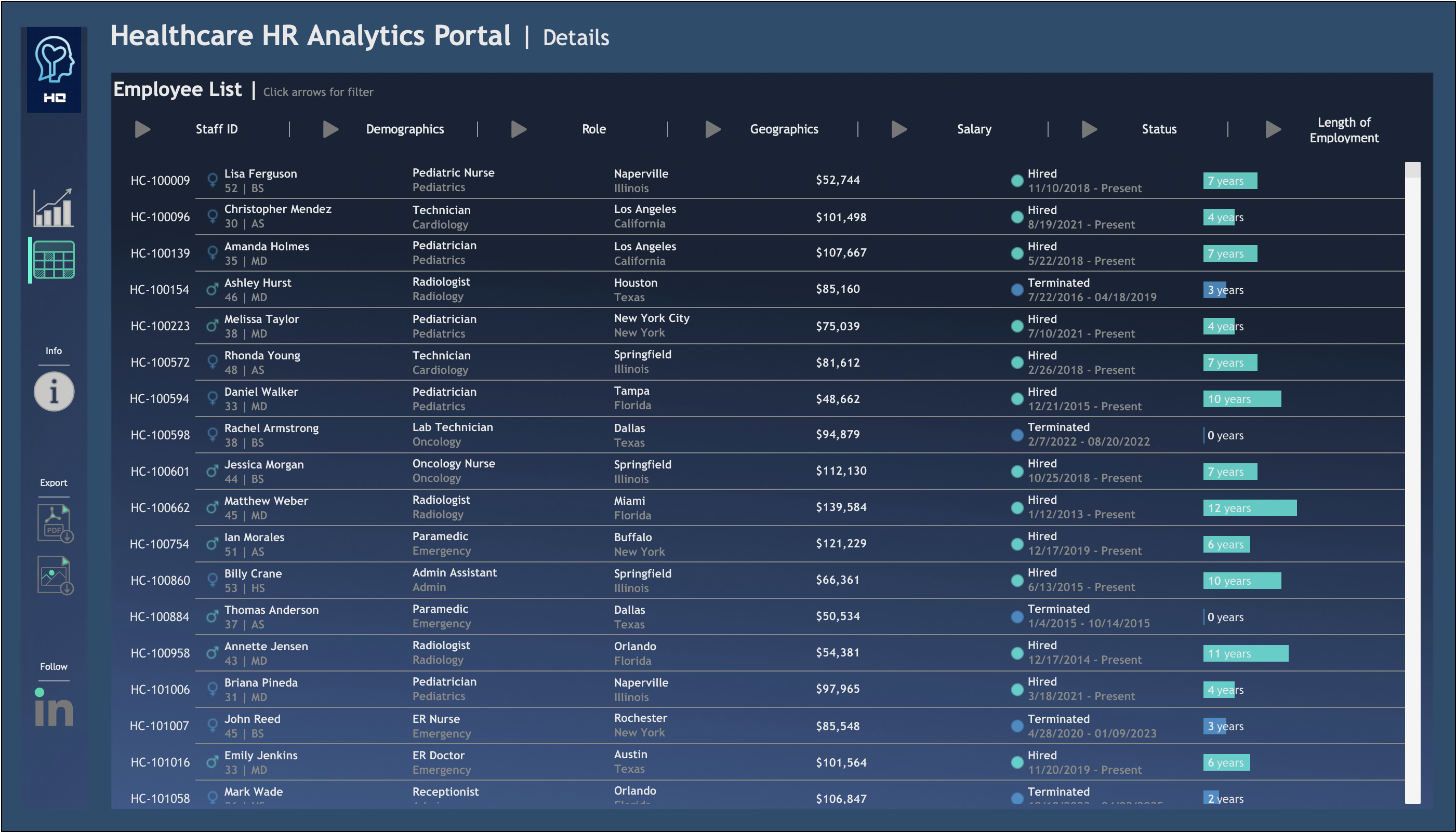
This project is a healthcare-focused version of the HR dashboard walkthrough by Data with Baraa. I adapted the structure to simulate a healthcare HR system and visualize staff distribution, demographics, and compensation insights across hospitals.
Tools & Technologies
- Python + Faker (for synthetic dataset generation)
- Tableau Public (for visualization)
- Draw.io (mockup design)
- ChatGPT + Photoshops + Data with Baraa (custom icons)
Dashboard Highlights
- Staff Overview: Hired, active, terminated breakdown
- Demographics: Gender, age, education, certification analysis
- Compensation: Base vs. adjusted salary insights by gender, shift, department
- Shift Comparison: Salary vs. shift type (day/night)
- Experience Correlation: Age & tenure vs. compensation
- Employee Table View: Filterable by department, shift, and status
Key Insights
- Adjusted salaries reduced gender-based pay gaps, but disparities still exist in some departments
- Night shift staff tend to earn higher salaries in roles like Emergency and Pharmacy
- Pediatrics and Admin departments show strong female representation
Acknowledgment
Special thanks to Baraa Khatib Salkini for inspiring the original HR Dashboard design structure.